Year
2024-2025
Scope of work
Product Design
User Research
Branding
Marketing
Figma
Project Management
Prototyping
Domain
E-Commerce
Role
Sr. Product Designer
Duration
Launched an e-commerce brand from 0-1. Built brand aesthetic, website that aimed to cultivate customer loyalty through honest marketing and a focus on user experience.


Understanding the Customer
Before starting any design, I need to understand the consumer. Understanding their considerations is imperative to cultivating a brand, earning their trust and providing an experience that resonates and stands-out from all the others.
I based this persona by crafting assumptions and listening to the CEO and really understanding who these shoes were made for:
Mid 30's male
Established in his career
Would pay extra for comfort & style
Required versatility in his wardrobe — work & pleasure
Once I had a picture of the customer, I thought about their needs for style, fit & quality.
What information do they need to see to feel confident in their purchase
The shopping experience they see value in and deem trustworthy
What are their needs are for the product and in what ways can we reinforce this with the experience.
This persona guided all of my design choices from branding, site layout, & design.
An important aspect of this brand is the visual style, so I wanted to kick-off the design process at the atomic level.
I used a two-font structure, Serif & Sans Serif.
Didiot Headline H1-3
Cabinet Grotesk B1-3
Didiot looked great as a headline font but was difficult to read, so I paired a Grotesk font that meshed well but maintained readability for all sizes.
We also wanted to keep the site very neutral, sticking with black, white & grey to allow for the products to really stand out on the page.
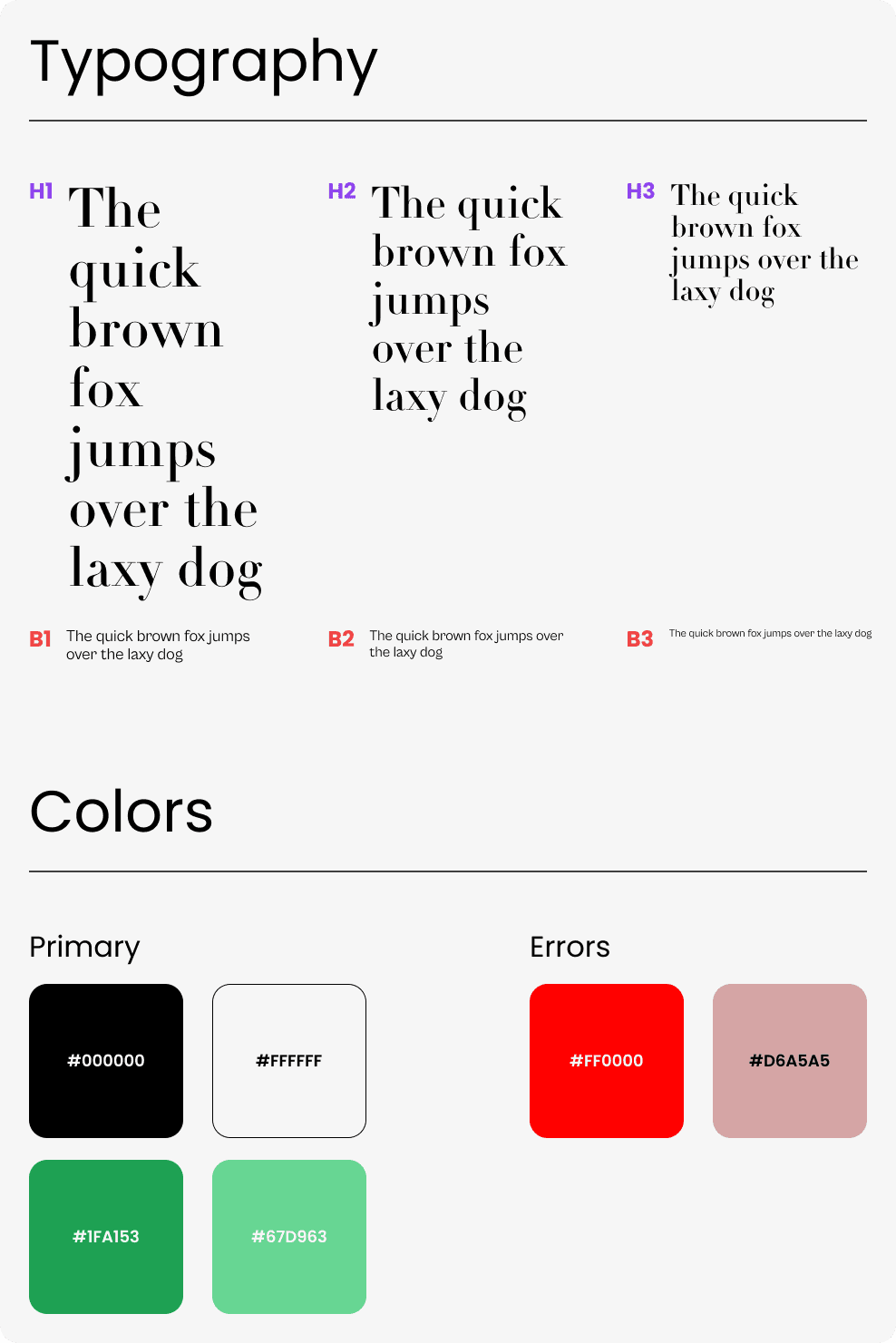
The logo followed the H1 typeface with a fun incorporation of the anagram embeded on the foam liner within the shoes

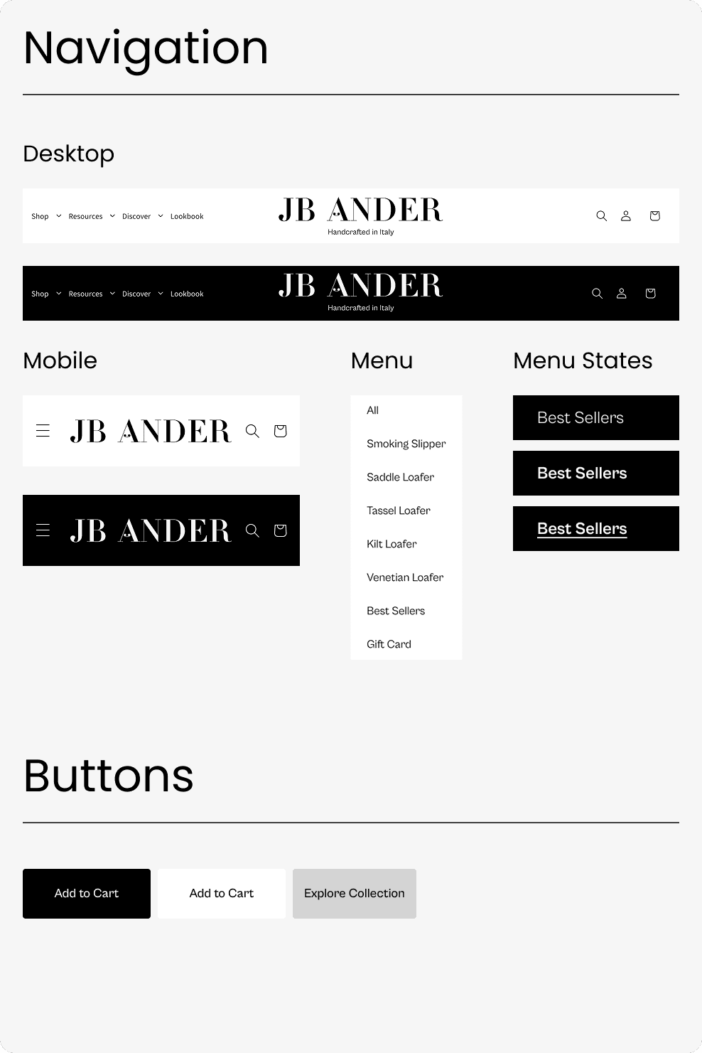
Componentry
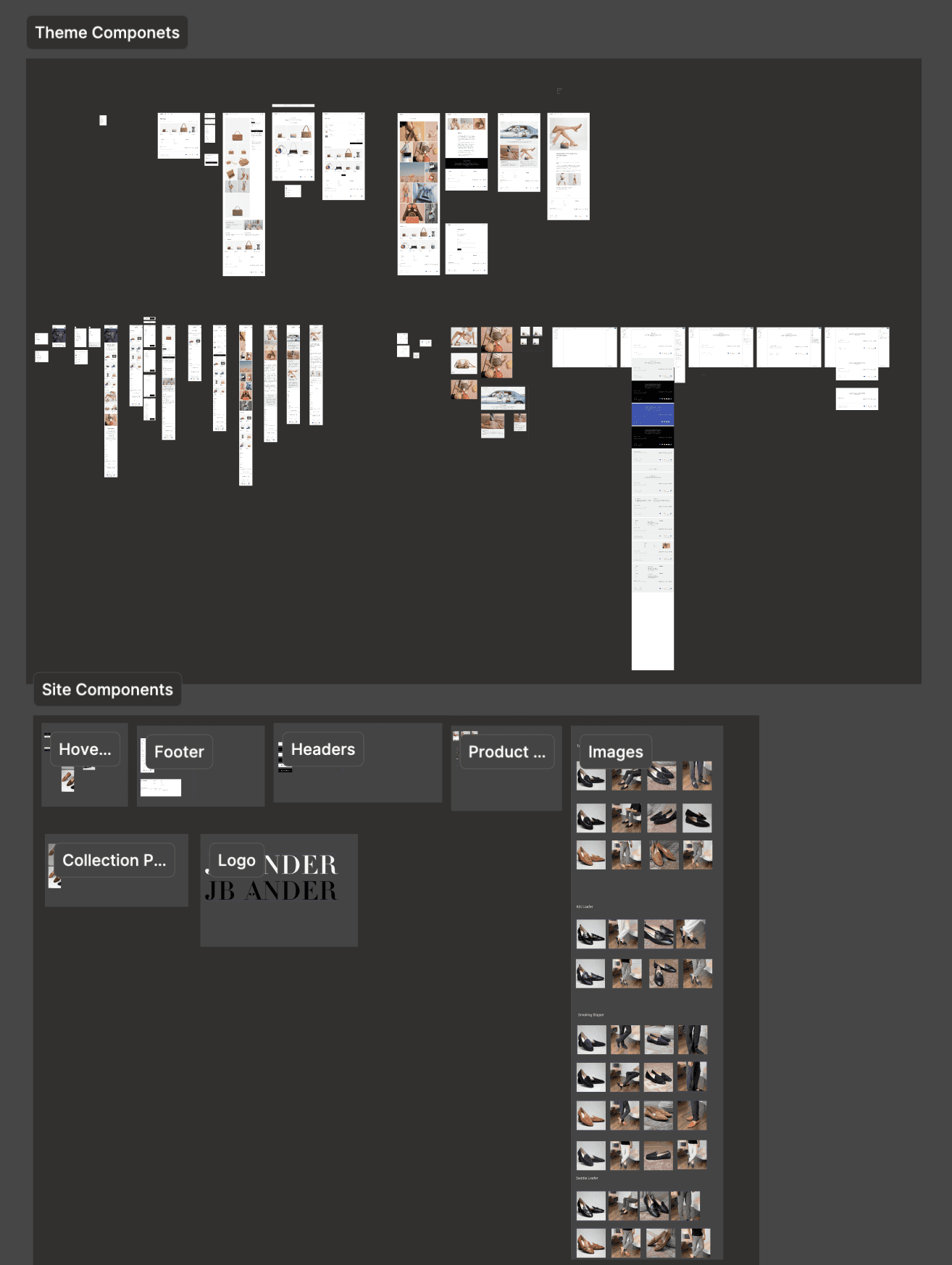
The team hired an off-shore developer that we found through Shopify's partner directory.
We began with an initial kick off meeting to better understand feasibility with my designs.
The challenges during implementation were:
Shopify's template was very limiting with animations and interactions. While my designs weren't heavy on animations there were some that the platform wouldn't allow.
The hero image was essentially a slideshow of 3-4 images, promoting different sales or products. The imagery used in my initial designs were not going to be compatible and the layout needed to be reworked.
The way the products were initially input into Shopify needed to be re-worked to allow for color swatches, since each shoe had varying colors, color swatches would be essential to provide the user an easy experience exploring the product catalog.
Working with an off-shore development had challenges in communication & iteration. While I prefer working with local development teams, it was a welcome challenge. It made me re-think my communication & handoff practices.

We are still iterating and learning as we grow and get more feedback from our users. This was the version we launched with, you can find the live site www.jbander.com