Orly Beauty
Year
2024
Duration
6 Months
Orly Beauty is a well-known nail care brand with high-quality polishes and treatments. They asked me to update their old website.
Seeing an opportunity to make a lasting impact, I couldn't wait to get started.
For three months, I learned about their brand, culture, and business goals. In the end, I created a user-friendly site that increased sales and gave their online brand a fresh new look.
Results
+47% CSAT
The original experience frustrated users when trying to navigate Orly's product line.
The redesign streamlined search Product Display Page & Filters, directly translated to measurably happier customers.
+18% Order Volume
Clear visual hierarchy highlighted complementary items at key decision points.
This created a discovery experience that felt helpful rather than pushy, encouraging larger baskets without friction.
Refined Search
By grouping fragmented finish and polish categories into logical collections, I eliminated decision paralysis and streamlined browsing.
Customers now discover relevant products without scrolling through dozens of scattered results.
+26% Conv. Rate
Better product organization and streamlined purchasing flow reduced drop-off points.
Customers found what they needed faster and completed transactions with fewer hesitations or barriers.
Opportunity
Challenges
Outdated & Complex
The site had become overly complex with UX elements that hindered user flow. Customers struggled to navigate the product catalog and complete purchases efficiently.
Market Position
Orly's competitors and third-party vendors offered more contemporary and familiar shopping experiences. Customers were choosing to shop elsewhere due to the outdated interface.
Incoherent Design System
The design system was not consistently followed across the entire site, creating a fragmented experience that undermined brand trust and usability.
No Development or Engineering Resources
With no dedicated dev team and only a 6-month contract, I needed to design solutions that could be implemented efficiently within tight technical constraints.
No Development or Engineering Resources
With no dedicated dev team and only a 6-month contract, I needed to design solutions that could be implemented efficiently within tight technical constraints.
Discovery
To start, I conducted a UI/UX audit focusing on
• User journey from site entry -> checkout
• Site Navigation
• Typography patterns, styles and structure sitewide
The audit revealed two key areas that would have the most impact on improving user experience.
These areas became the focus of my strategy
Navigation & Drawer Menu.
Product Discovery


Solution
Navigation & Drawer Menu
The current drawer menu lacks a clear visual hierarchy to distinguish main categories from subcategories, increasing cognitive load for users as they navigate and explore the product catalog.
A clear navigation will help
Improve User Experience
Clear navigation reduces friction
Visual Hierarchy
Clear categories guide users.
Visual Appeal
Showcases brand aesthetic and improved product organization

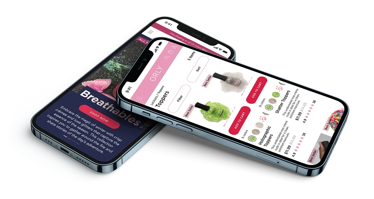
Product Discovery
-> Customer Opens link via notification
-> Views Payout overview: Price, Description, Merchant Details, Instructions on next steps
-> Enters Secret Answer
-> Select their bank
-> Authenticates & chooses account
-> Receives funds instantly
Real-World Prototype
I redesigned the complete shopping journey, transforming how customers discover and purchase products.
Core changes:
Reorganized navigation around customer shopping behavior (color, finish, formula)
Introduced interactive color swatches reducing the need to visit multiple product pages
Streamlined product taxonomy reducing search results by 88%
Improved visual hierarchy keeping critical conversion elements visible throughout
Have a look for yourself, interact below or click link
*Opens Figma
Design System
The Problem
Building the payout workflow exposed rigid design system architecture.
Components lacked the flexibility to adapt across payment types or verticals, often forcing designers to detach instances from master components for customization.
This created inconsistencies, slowed delivery, and complicated engineering handoffs.
The Solution
Robust components with single layer customization
Organized Components by Type & Usage
This variant-based approach enabled components to:
→ Maintain visual consistency when customized
→ Allow single-layer editing instead of managing multiple layers
→ Adapt across Prompt's different verticals through variants
→ Scale responsively across all devices and screen sizes
The Impact
Feature iteration and delivery accelerated by 40%.
This efficiency gain compounds across every subsequent design excercise, feature & established reusable patterns for future products at Prommt.
Key Takeaways
→ API integration requires design thinking
Translated NatWest's three-part data structure into a logical user journey
→ Security Requirements
Became trust-building features through proper framing.
→ Information Architecture
Organizing 20+ statuses by "what users need to do" rather than backend processes made the system understandable to non-technical dealership staff.
→ Design System Investment
The 40% efficiency gain from component refinement applies to every feature built afterward, demonstrating the ROI of treating design systems as first-class product work.
→ Domain Expertise
Researching, understanding & empathizing with Merchants and their customers was integral to understanding the true direction of a successful product.

